UX design work

UX design work

UX design work

CVS Health

CVS Health

CVS Health

Overview

Overview

Overview

CVS is a wellness business, delivering cutting-edge health solutions. They specialize in retail goods aimed towards health preservation and holistic wellbeing, prescription deliveries via mail, and managing chronic conditions.

My role

Senior UX designer

Teams worked with: Product management, product design, content design, acessibility, business stakeholders, engineering


  • Net new prescriber block for the prescription renewal experience that allows for patient transparency into that process that includes how many times their prescriber was contacted as well as the prescriber's phone number at reach in case the patient wants to get in touch

  • Info-badges that helped identify an aspect of the prescription, if it was eligible for delivery, climate controlled or a medical supply, it would display the badge on the Rx card itself providing additional detail to the patient

  • Status badges that identified when a prescription required further attention from the patient asking them to resolve something to move the order process along like "action required, update prescriber information, update payment information, we need your help" to name a few.

  • Carrier logo integration that replaced the generic, red delivery truck. With this enhancement, it eliminated the guesswork on who exactly was delivering the order to the patient and also reduced calls to the pharmacy as a result

My role

Senior UX designer

Teams worked with: Product management, product design, content design, acessibility, business stakeholders, engineering


  • Net new prescriber block for the prescription renewal experience that allows for patient transparency into that process

  • Info-badges that helped identify an aspect of the prescription, if it was eligible for delivery, climate controlled or a medical supply, it would bear the badge on the Rx card itself providing additional detail to the patient

  • Status badges that identified when a prescription required further attention from the patient asking them to resolve something to move the order process along like "action required, update prescriber information, update payment information, we need your help" to name a few.

  • Carrier logo integration that replaced the generic, red delivery truck. With this enhancement, it eliminated the guesswork on who exactly was delivering the order to the patient and also reduced calls to the pharmacy as a result

Selected work

Selected work

Carrier logo enhancement

Carrier logo enhancement

Carrier logo enhancement

This was a feature enhancement to include carrier logos within the shipping block on the Order details page and replace the generic delivery truck from the previous experience. This helped provide transparency for users on who was delivering their orders and helped reduce calls by 75% to the pharmacy about who the patients were expecting to drop off their prescriptions. This was scaled and adapted across the other lines of businesses as well due to its success and value for our users.

Info-badges

Info-badges

Info-badges

A pain point we were able to address and solve for was implementing these info-badges that provided more context and drew more attention to the order cards since before this, the cards would blend in together and patients were missing important callouts. These badges increased engagement, transparency and a substantial reduction in calls to the pharmacy which helped increase pharmacy operations.

Your orders redesign

Your orders redesign

Your orders redesign

This redesign helped us streamline design consistency across various experience touch points and bring those design elements together. We introduced order cards that were led by color, statuses and promise times. Highlighting all the important information a patient needs at a glance's view and reducing the need for them to look further for the information they need.

Prescriber outreach block

Prescriber outreach block

Prescriber outreach block

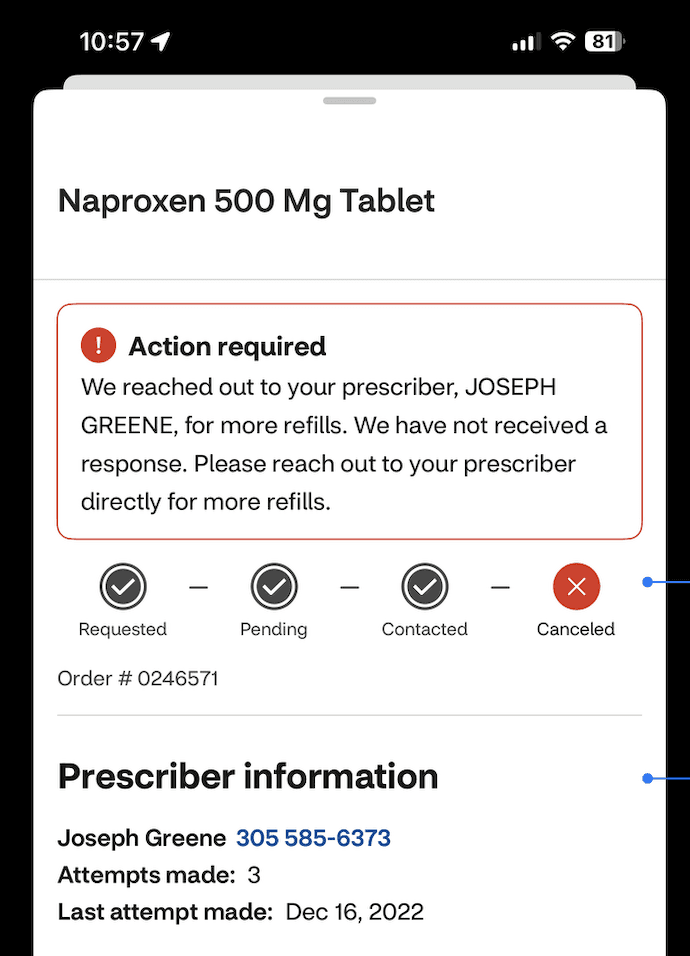
A pain point that we solved for with this prescriber outreach block was that patients did not have visibility into the prescriber outreach process from end to end. This enhancement provided them with visibility from the refill request pending, to contacted and to eventually approved or canceled. We also provided the prescriber phone number at reach so the patient can contact them if needed. This helped increase user engagement, improved satisfaction with the prescriber outreach experience and saw a reduction of calls to the pharmacy regarding status by 70%.

NDA protected work

A majority of work not shown due to being NDA protected. I can provide further insights into the holistic process if asked

© Designed by Kenlee Castillo Chang 2025